Composition
Knowing the Rules: Every creative journey needs a foundation. While art is about freedom, expression, and imagination, understanding a few guiding rules gives you the confidence to create with intention. I often say, you have to know the rules before you can break them. I’m certainly not the first to say it—but I’ve learned firsthand just how true it is.
The guidelines below are the “rules” of design and composition. They aren’t meant to limit your creativity, but to strengthen it. I encourage you to read through them and practice using them as you create. With time and repetition, these ideas will become second nature. And once they do, you’ll know exactly when—and how—it’s okay to break the rules while still creating a strong, compelling piece of artwork.
The Rules of Design & Composition
Focal Point: The focal point is the primary area of interest in your artwork. It’s the main character in your story, the hero of the movie—the place where the viewer’s eye naturally goes first. In our work, this might be a plant, a flower, or another central subject. A clear focal point gives your piece direction and purpose.
Rule of Thirds: The rule of thirds uses an imaginary grid divided into three equal sections horizontally and vertically, creating nine parts. (See the example below.) The goal is to place your focal point at one of the four intersecting points of the grid rather than directly in the center. This creates a more dynamic, balanced, and visually interesting composition.
Using the rule of thirds naturally encourages asymmetrical designs, which often feel more energetic and engaging than symmetrical ones. Think of this grid as a simple guide—not a restriction. Place your main focal point at one intersection, and if your piece has a secondary focus, place it at another. These choices help guide the viewer’s eye through your artwork and support your visual story.
Rule of odds: when composing your layout using an odd number of elements will make for a much more interesting and dynamic composition. Viewers are drawn to art that is energetic and alive. Creating an odd number of components (3 to 5) is a great way to create energy.
Line: is a long, thin mark on the surface of something. In design, learning how to use your line formations is another way to make you drawing your own. From the way you might use lines to draw your viewer into your piece to they way you create texture - all of this helps to form your own style and personality in piece.
Color Composition: is the purposeful, thoughtful, and balanced use of color to tell a visual story. When used intentionally, color creates harmony and unity within a piece and helps guide the viewer’s emotions and attention throughout the artwork.
Visual Tension (Mark Making): is created through expressive mark making that adds interest and energy for the viewer. One effective way to achieve this is by varying the pressure and width of your lines while illustrating. Over time, this variation becomes part of your unique style and helps set your work apart. When used thoughtfully and in moderation, visual tension provides a strong finishing touch to your artwork.
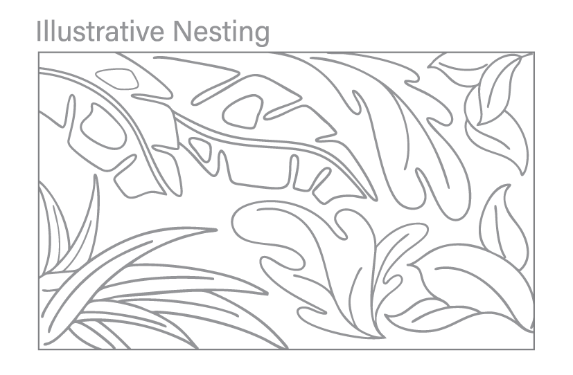
Illustrative Nesting: is the intentional placement and spacing of elements within a composition—often from an imagined point of view. This approach gently leads the viewer’s eye from one object to the next, creating a sense of connection and cohesiveness throughout the piece.
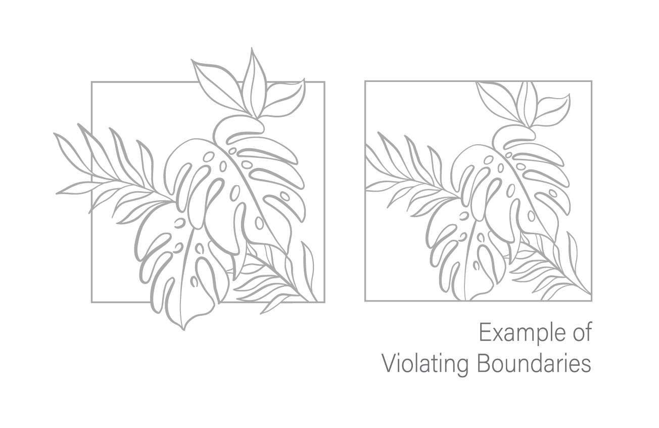
Violating Boundaries: is the deliberate choice to let elements extend beyond the edges of your composition. Allowing shapes, lines, or forms to continue outside the frame invites the viewer’s imagination to complete the story. Artwork where everything is tightly contained within the boundaries can feel static or predictable, so letting elements break free adds movement, curiosity, and visual excitement.
Illustrative Nesting: is the intentional placement and spacing of elements within a composition—often from an imagined point of view. This approach gently leads the viewer’s eye from one object to the next, creating a sense of connection and cohesiveness throughout the piece.
Violating Boundaries: is the deliberate choice to let elements extend beyond the edges of your composition. Allowing shapes, lines, or forms to continue outside the frame invites the viewer’s imagination to complete the story. Artwork where everything is tightly contained within the boundaries can feel static or predictable, so letting elements break free adds movement, curiosity, and visual excitement.